Unifying design across Holmz's health platform
Holmz · Design system 2025
Overview
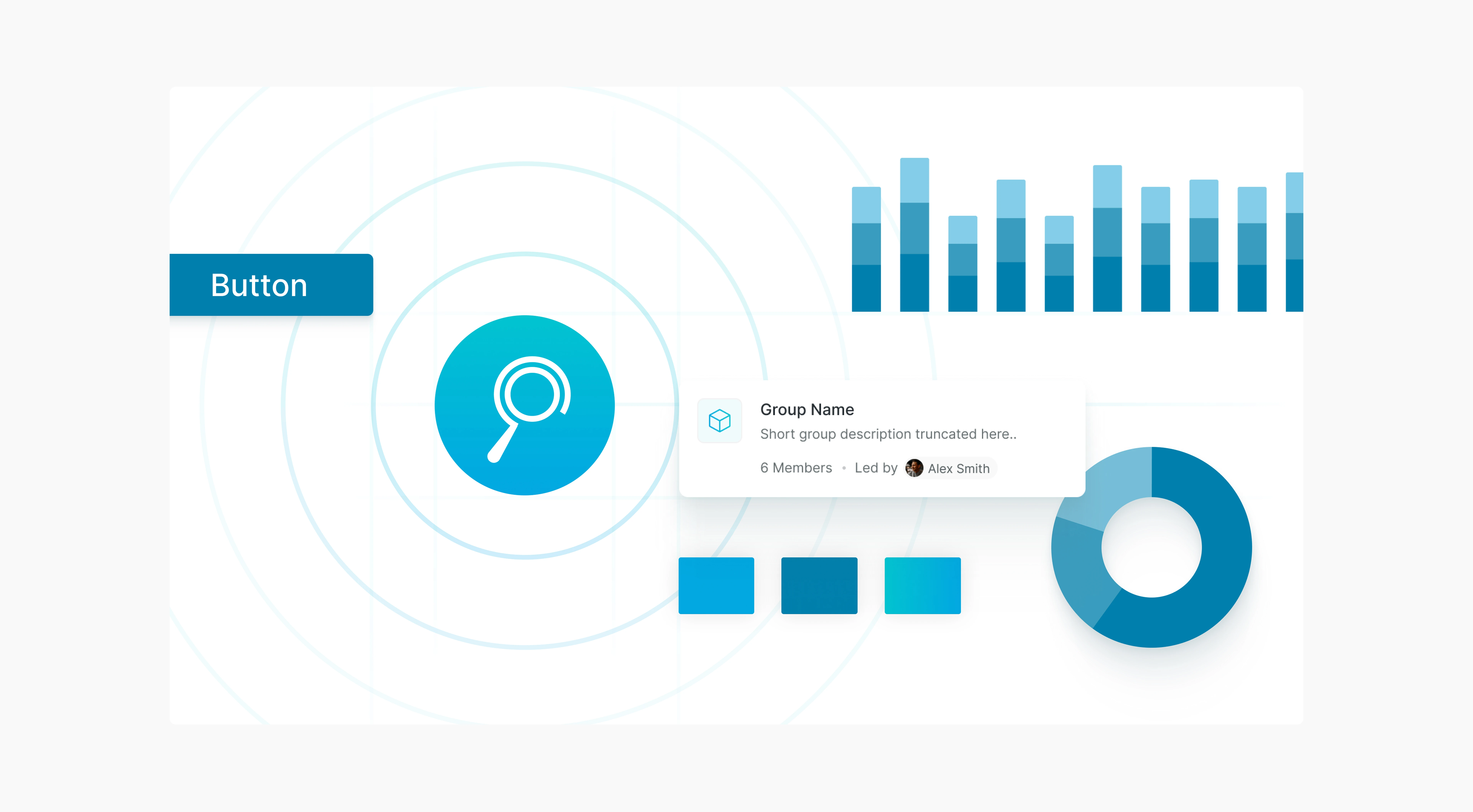
As a Product Design Lead at JumpStartCSR, I spearheaded the creation of our first design system—building foundation styles and reusable UI components to ensure consistency and streamline engineering workflows.
When I joined the project, the product’s UX felt fragmented - inconsistent button styles, misaligned brand colors and a visual gap between the website and iOS app, resulting in design–dev misalignment, diluted branding and slowed rollout cycles. Tasked with building a new admin platform from the ground up, I took the initiative to establish a new design system that unifies platforms, reduces design debt and accelerates delivery.
NDA Restricted


Problem
The existing component library couldn’t support product growth.
JumpStart worked with a mix of in-house designers and contractors, but without a unified design system, they had no solid reference point. Past designers created makeshift component libraries and documented handoffs as needed across different products. As the product grew, this patchwork system became a bottleneck, causing friction between design and development. We needed a design system and a component library that could scale with the product, support new features, and reduce the overhead of constant redesign and rework.
Approach
Establishing a shared language through tokens
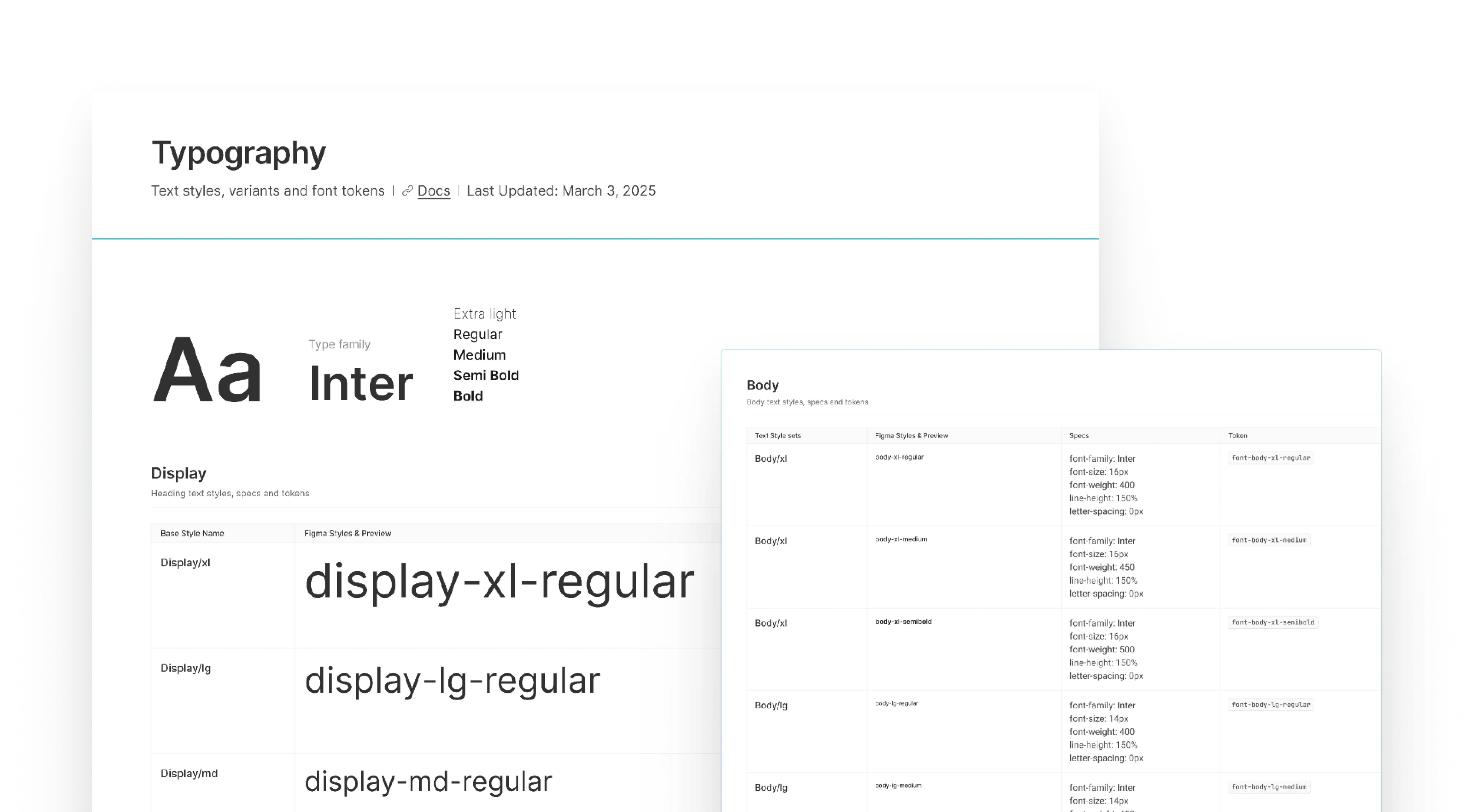
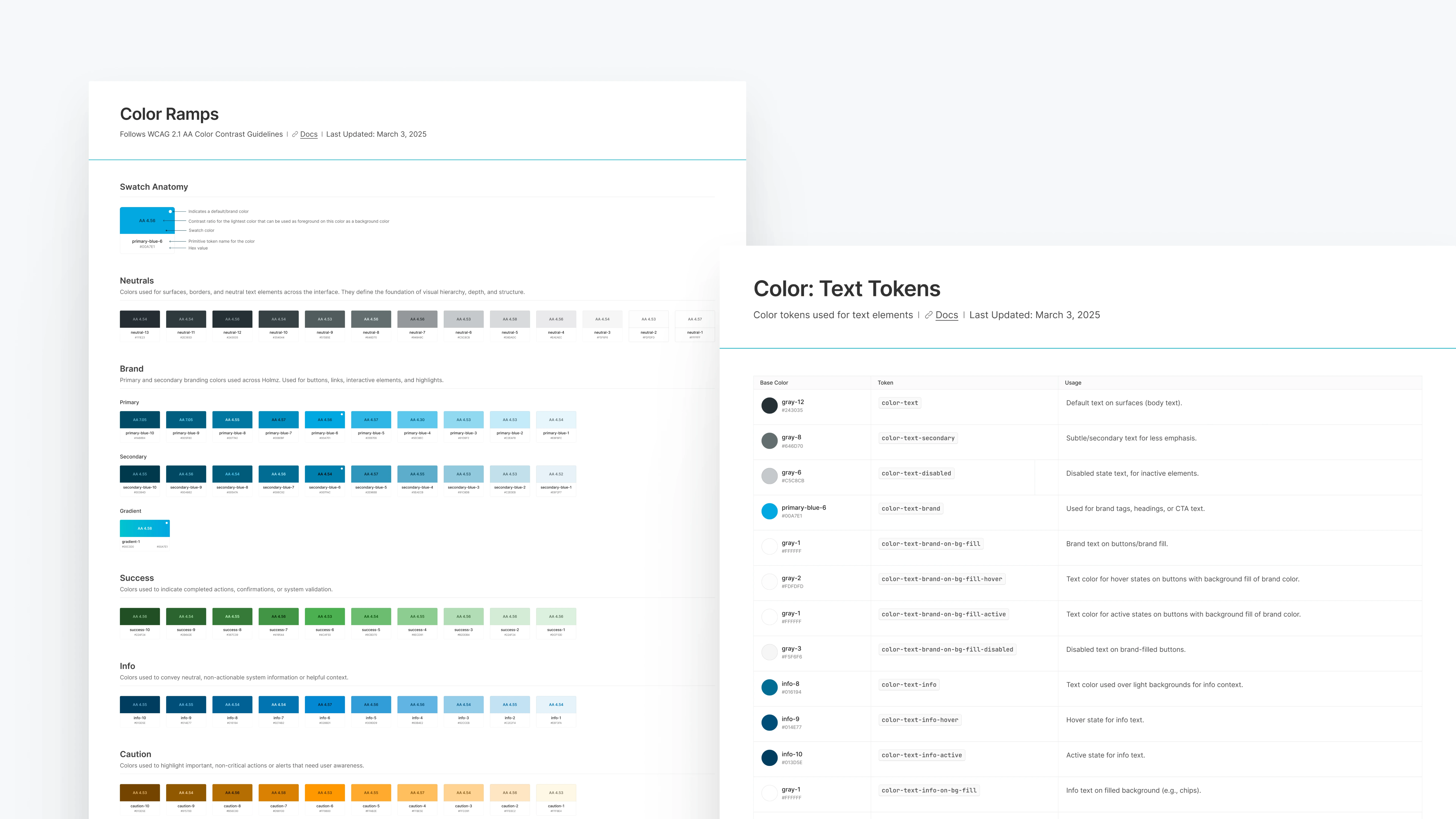
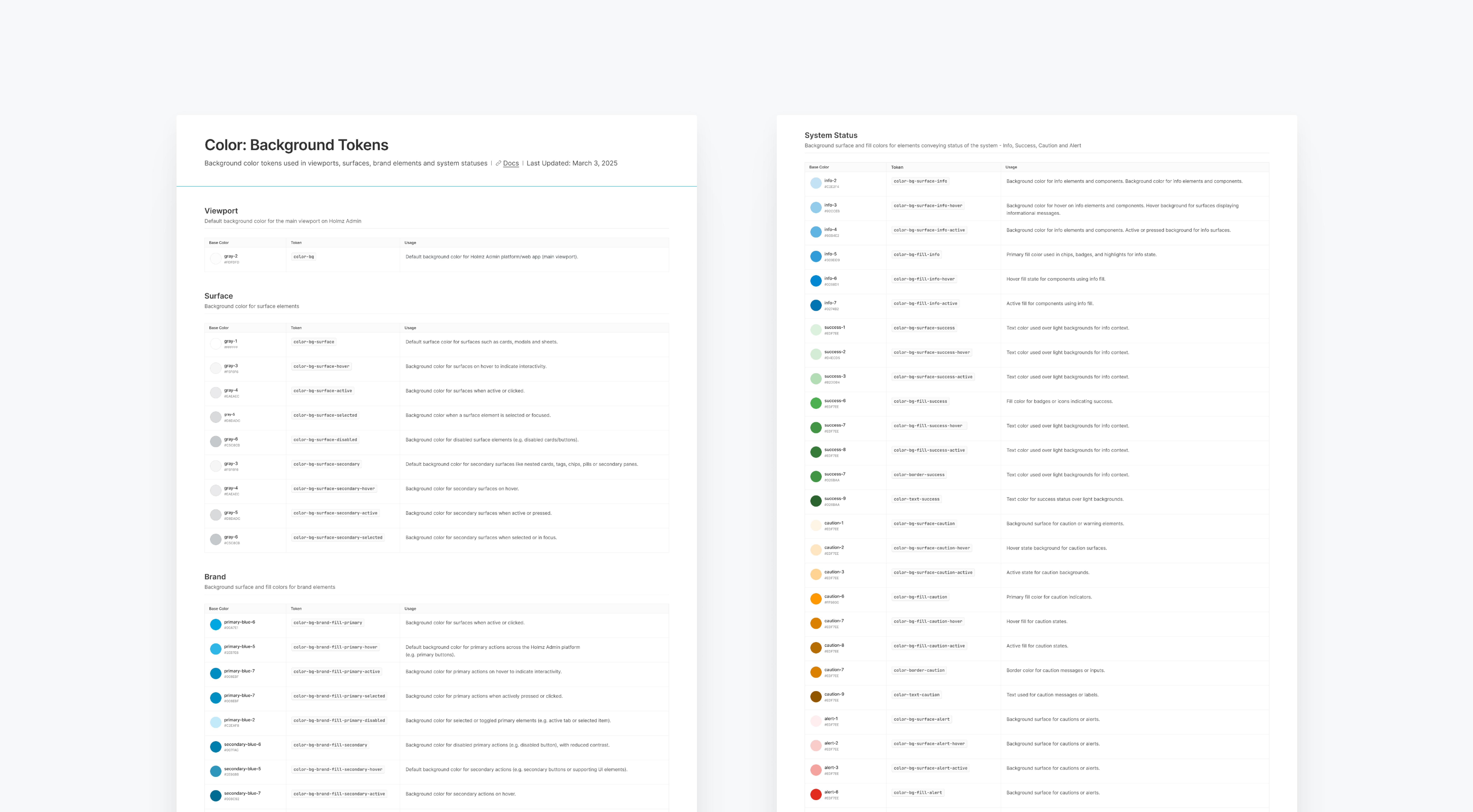
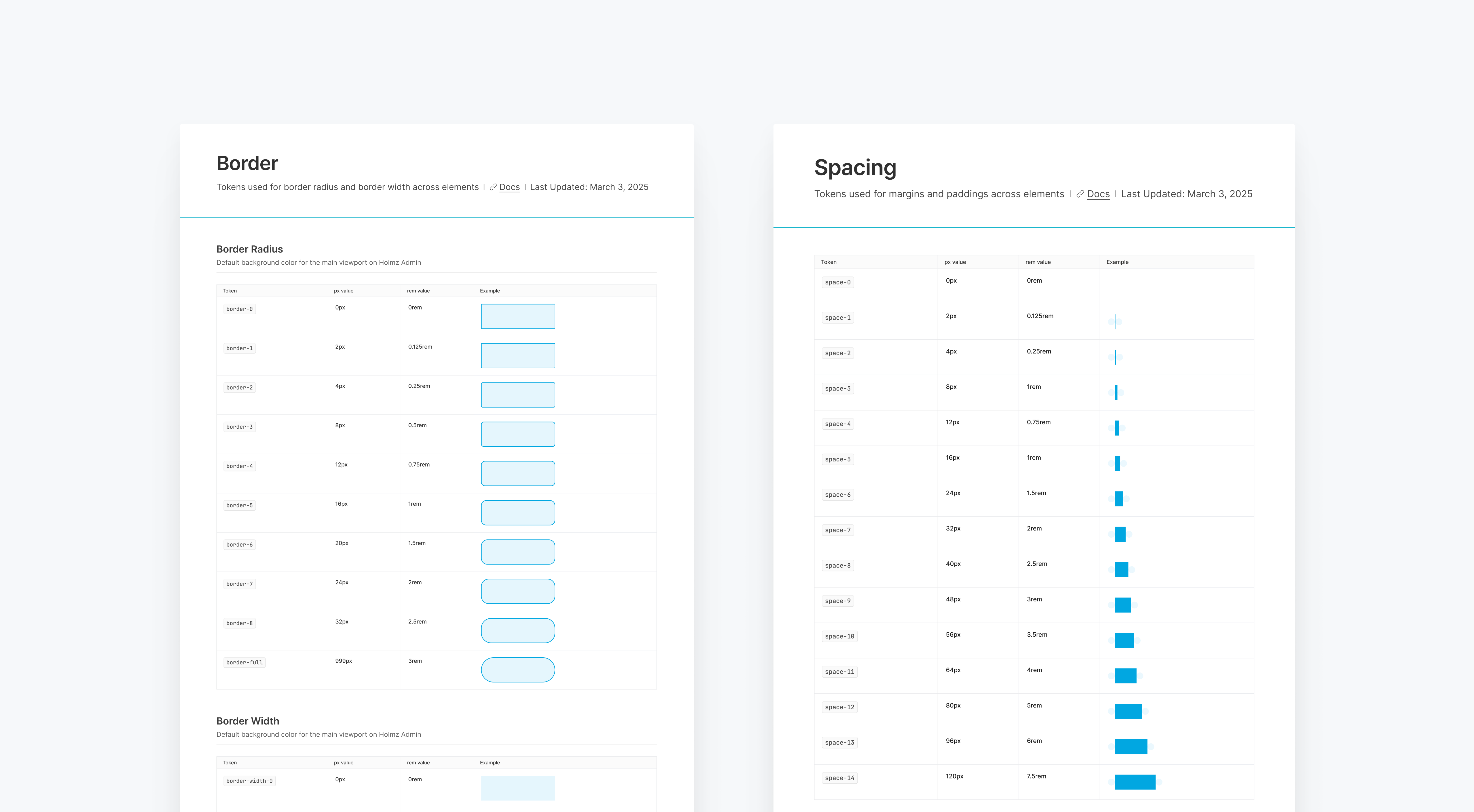
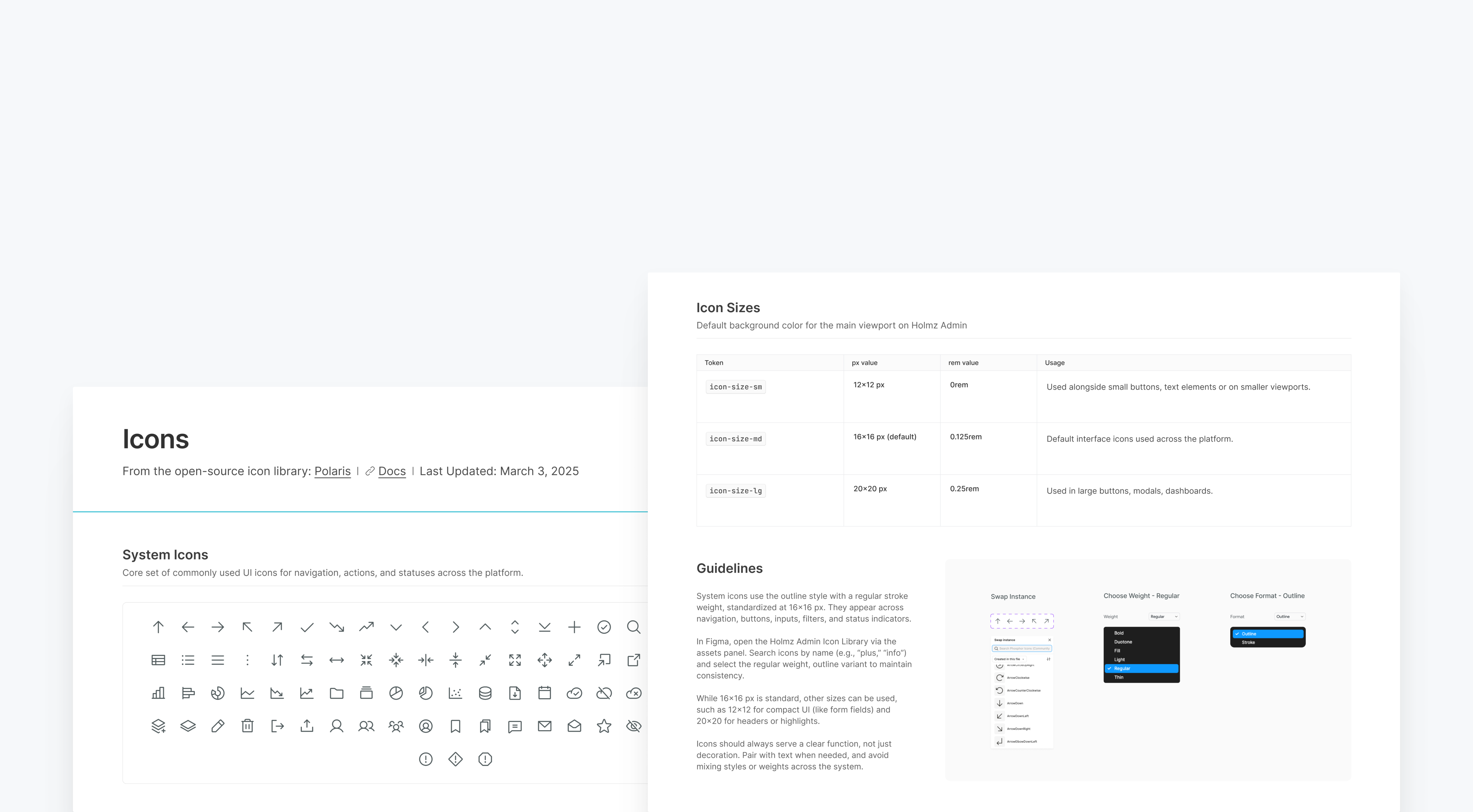
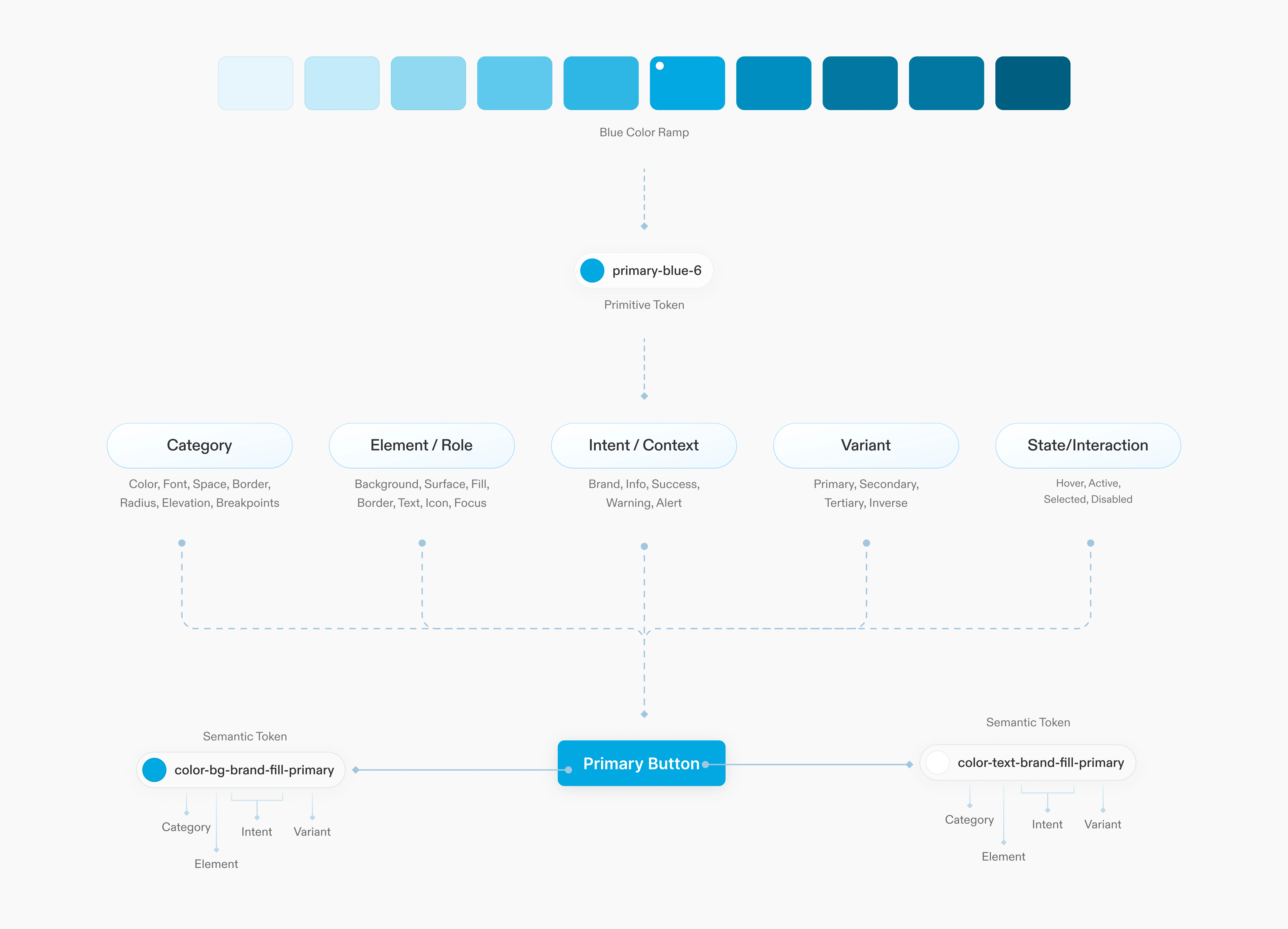
I worked closely with the engineering team to define global values and establish a token architecture that made sense to everyone using it—covering primitive and semantic tokens, from foundational styles to nested components and patterns. We aligned token names with the variables used in code, creating a direct link between components in Figma and the codebase. This setup kept design and code in sync—any change to a token automatically updated across the product, keeping the system consistent and easier to maintain.
Using atomic design principles for component modularity
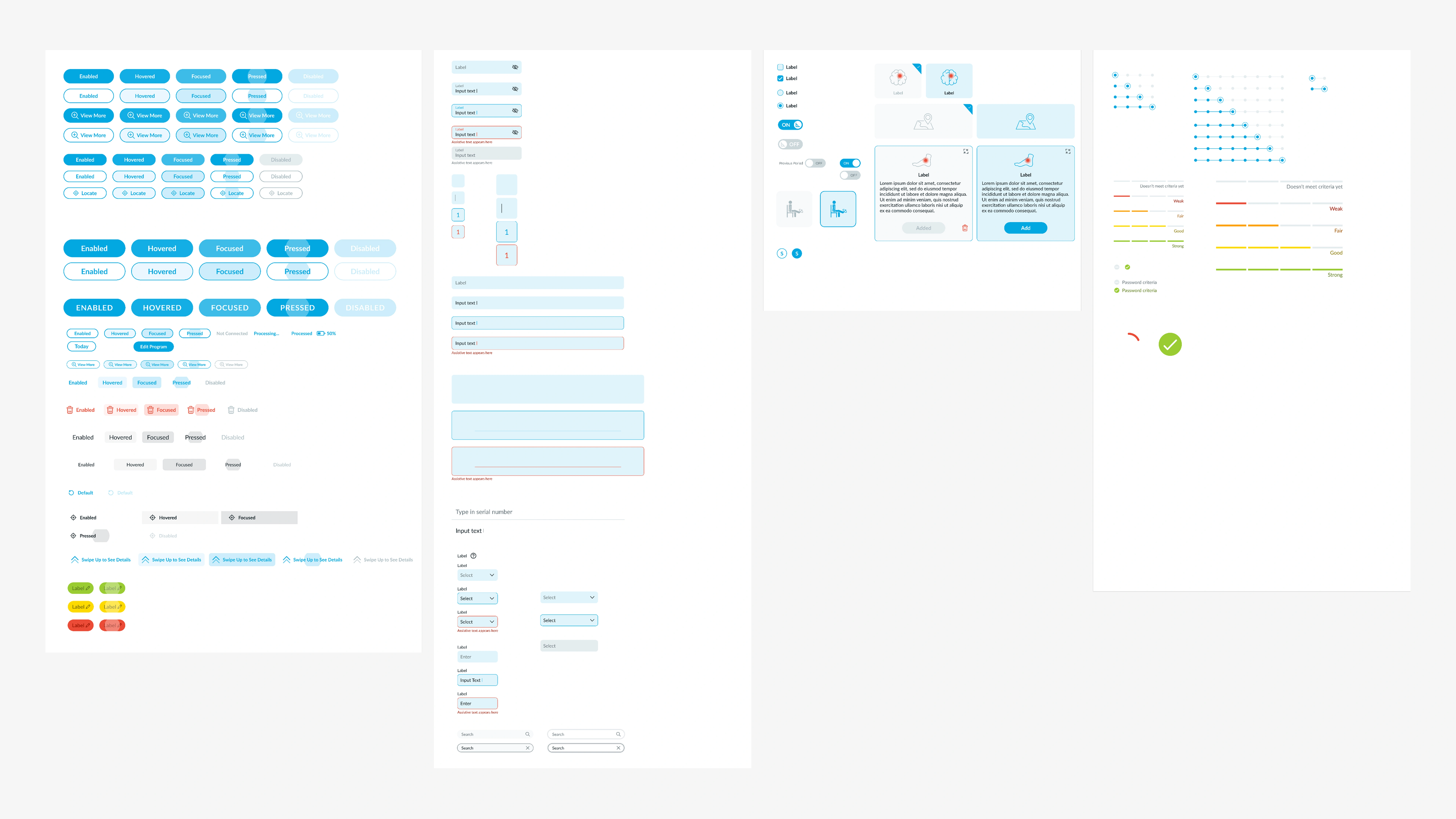
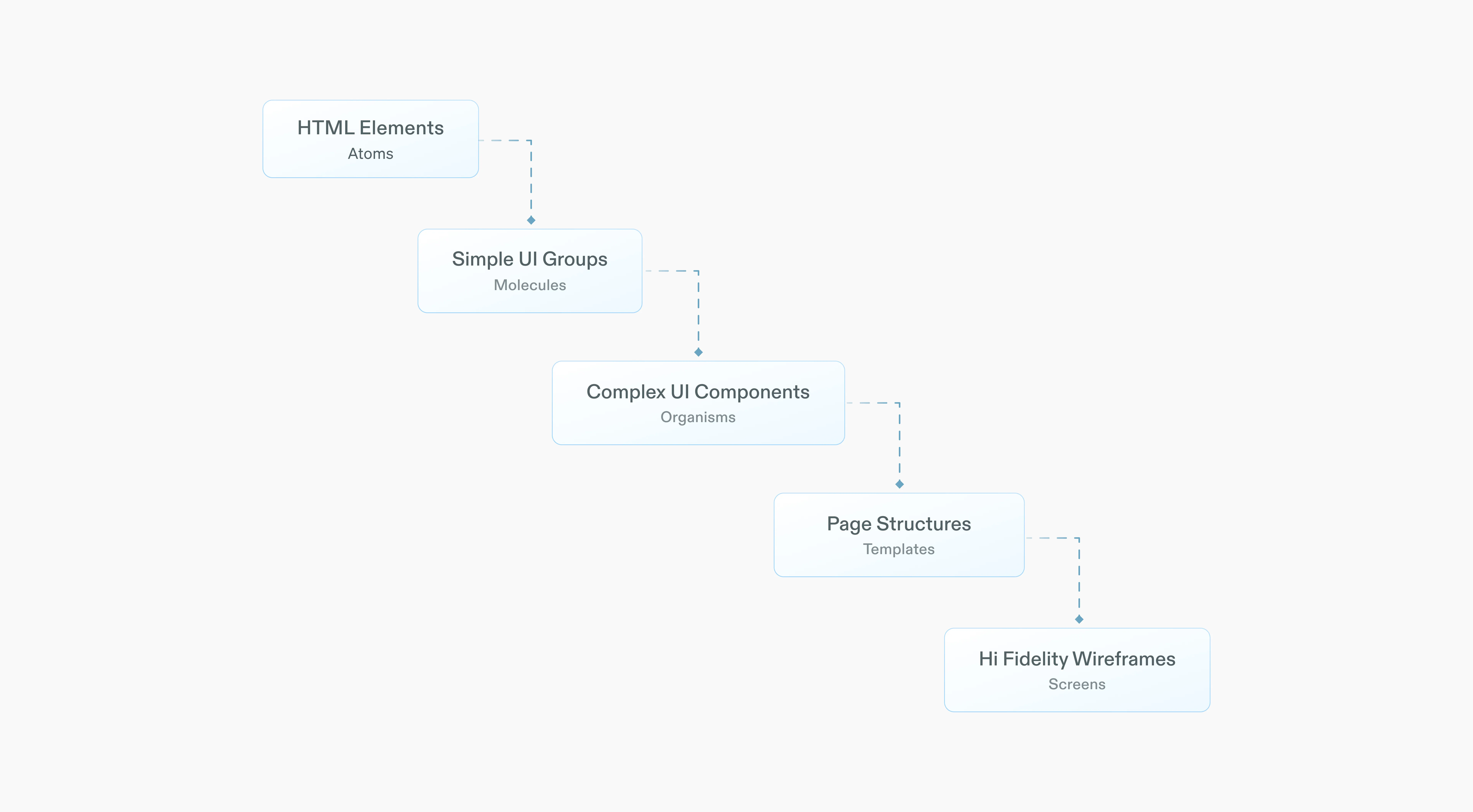
I applied an atomic design approach to manage component sizes at the smallest level—creating variants for atomic components like buttons and inputs, which were then nested into more complex components to create UI layouts and page structures. Using atomic principles, all complex UI elements were built by composing these nested components. This helped keep file sizes and component matrices manageable while creating a foundation that supports rapid iteration.
closing thoughts
Using design systems as a framework and philosophy
Building this design system was a journey of transformation—not only for our product but also in how our team collaborates and approached design at scale. A successful design system goes beyond component libraries; it requires a shared vision across teams, clear processes for reviewing and evolving the system and a roadmap that balances priorities between design and development.
Equally important is fostering a culture of open feedback and maintaining documentation that extends beyond design files, providing support for the entire team.
At its core, the strength of the system lies in its ability to help teams move faster and with greater confidence, all while remaining adaptable to changing needs.
As we continue to evolve the system, the focus should remain on keeping it flexible, accessible and closely aligned with the needs of growing products and teams.
This work is under NDA.
Impact
The design system became the backbone for how the team designed and built—unifying web and mobile, automating manual workflows, and giving the org a shared foundation to ship faster with less rework.
